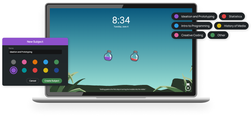
Float-it Notes
Daily Planner Extension
My Role
UX Designer, Front-end Developer
Team
Solo project
My Tools
JavaScript, HTML/CSS, Adobe Photoshop, Medibang Paint
Overview
Float-it Notes is a Chrome extension designed to help high school and college students stay afloat in the chaos of their lives. It creates a calming sanctuary on their New Tab page with a light-hearted aesthetic, offering task management tools to stay organized and motivated, while helping them regain a peace of mind in their daily routines.
I designed and developed a Chrome Extension independently.
This is a solo project in which I conducted user research, designed, and developed the user experience and interface for a browser extension. I plan to release it on the Chrome Web Store in the future!
Demo video of Float-it Notes
Problem
High school and college students often struggle with managing multiple responsibilities, resulting in increased stress and adverse effects on their well-being and academic success.
Balancing the demands of academia, employment, meetings, assignments, and deadlines presents a significant challenge for many high school and college students. Research consistently shows that individuals in this age group experience heightened stress levels as they attempt to manage these multiple responsibilities, often leading to negative impacts on their mental well-being and academic performance.
Goal
Help students keep track of their school, work, and personal responsibilities in a stress-free way.
Process
Interviewing high school and college students
I began this project by conducting interviews with 8 students aged 14-25 to get a better understanding of my targeted demographic’s goals and pain points when it comes to task management.
My initial user research goals were to find out:
- How do they track their tasks?
- How do they complete their tasks? Do they tackle them all at once or over time?
- Do they use planners (physical and/or digital) or have had in the past?
- What are their favorite parts about their current solution?
- Is there anything about their current solution that is lacking?
The main takeaways were:
-
Digital planner usage was the majority. Popular choices including Google Calendar, the Notes app, and Trello.
-
The main benefits and pain points of digital planners. Appreciated for accessibility, ease of organization, and reminder features. Lacking in task customization, tool complexity, and subject sorting/grouping options.
-
The main benefits and pain points of physical planners. Appreciated for flexibility in creativity and formatting. Lacking in organization, editability, and accessibility.
-
Students had mixed task completion styles. Completion styles (procrastination, immediate completion, or effort over time) largely depended on factors like task complexity, importance, interest level, and work capacity.
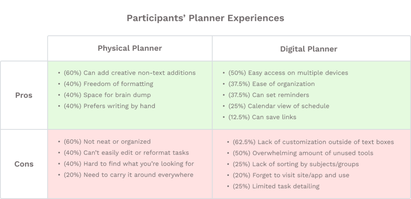
% indicates the proportion of participants who expressed these feelings, with overlaps
Analyzing other productivity extensions
Then, I conducted research on several popular Chrome extension competitors that take over the New Tab page, with a majority of them emphasizing productivity features.
This analysis allowed me to identify commonalities among existing solutions and pinpoint areas where they failed to address the pain points discovered in my user interviews. This also helped me identify opportunities for Float-it Notes to bridge the gap and provide a better user experience.
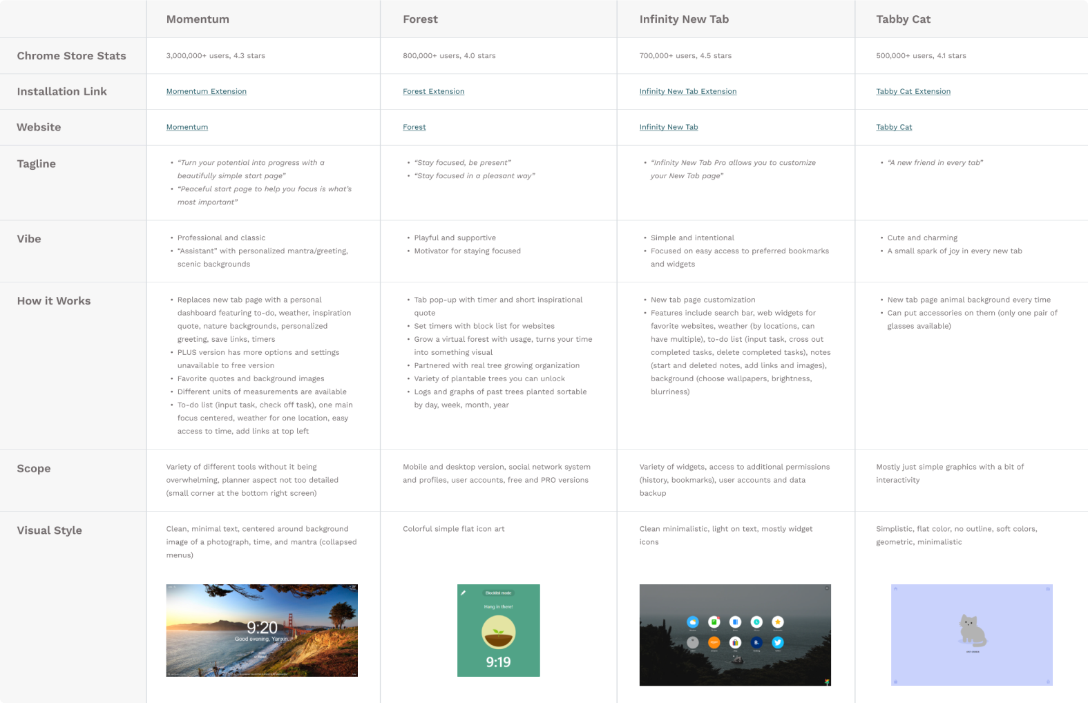
Competitor analysis of similar popular Chrome extensions
Prioritizing features for the Senior Capstone Exhibition
Based on my findings from user interviews and competitor analysis, I identified key features that users value in a planner/task manager. These insights guided the development of Float-it Notes, ensuring that it fulfilled user needs as a digital planner while also incorporating unique features that differentiate it from competitors.
I utilized the MoSCoW method to prioritize certain features to be
completed in time for my Undergrad Senior Capstone Project Gallery Exhibition
but plan to implement more features before releasing my extension onto the
Chrome App Store.
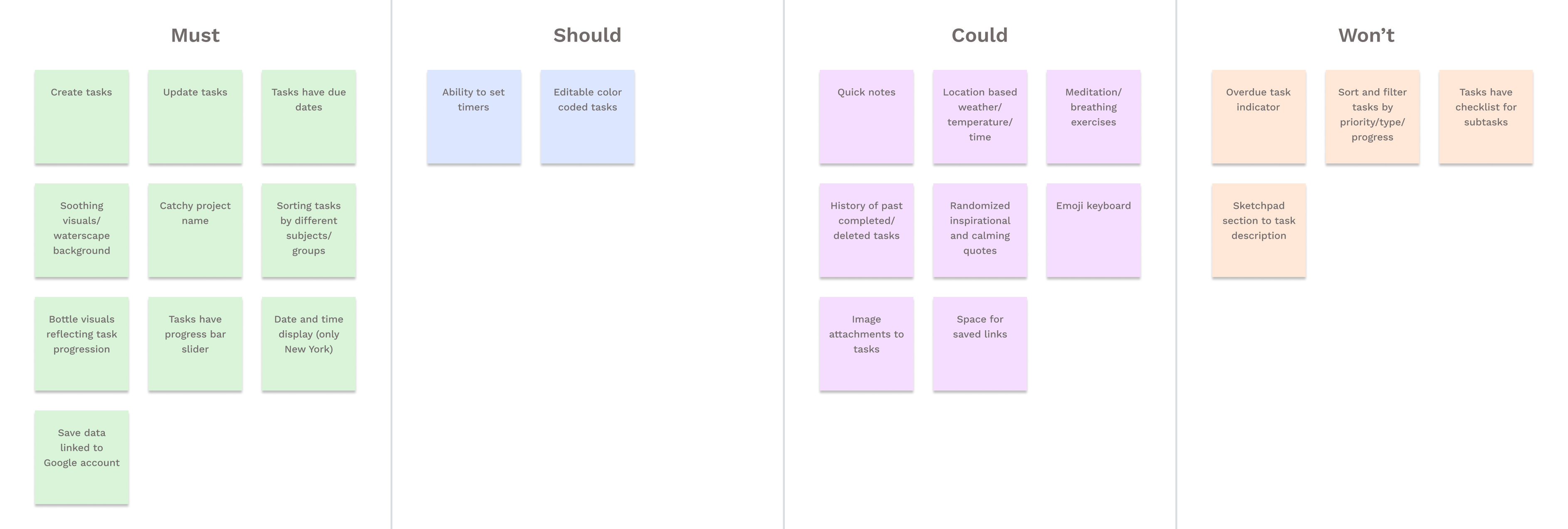
Feature prioritization with MoSCoW
Designing a unique and cohesive user interface
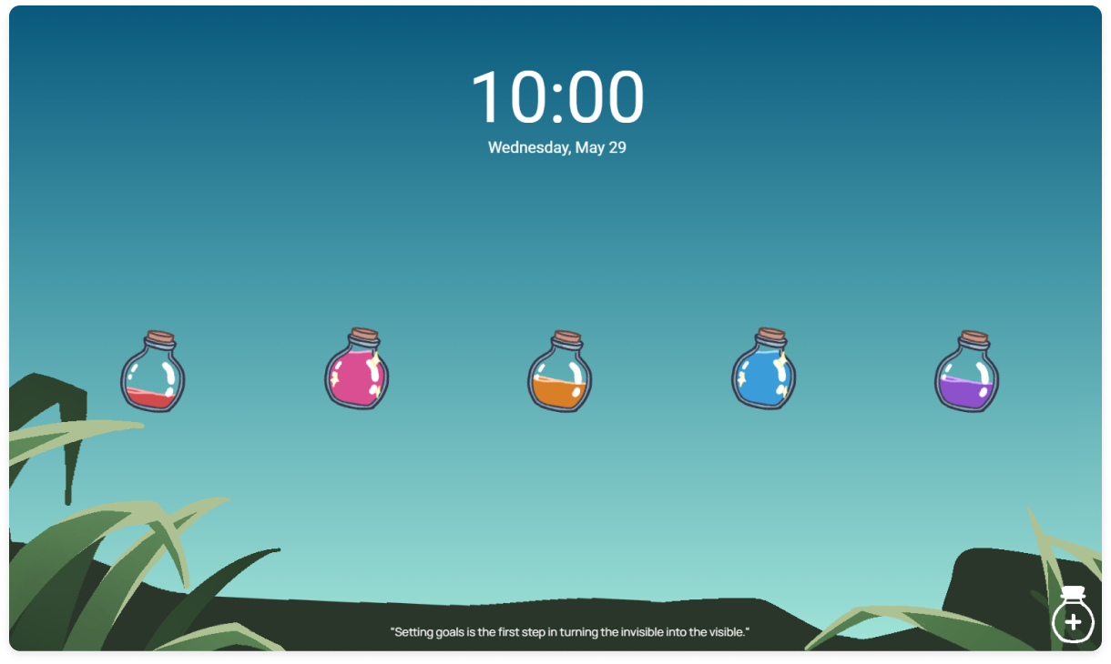
Next, I planned out the layout for Float-it Notes, incorporating features prioritized using the MoSCoW method. I envisioned a simple interface that centered around the user’s tasks, providing gentle reminders and task management tools each time they open a New Tab page throughout the day, without overwhelming them.
To achieve this, I chose a serene lake scene as the background for my extension. To ensure that the UI of tasks makes sense within the context of the environment, I decided to display tasks as bottles floating in the lake. This adds a unique and playful touch while maintaining coherence between the tasks and their surroundings.
I used illustration tools such as Adobe Photoshop and Medibang Paint to create the various UI assets, such as hand-drawn task bottles and waterscape background.

Mood board for Float-it Notes
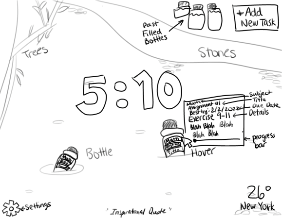
An early rough sketch of the interface
Developing an interactive prototype
Finally, with the designs and UI components ready, I began developing the first prototype of Float-it Notes using JavaScript and HTML/CSS.
Developing this Chrome extension has been a great opportunity to practice and refine my coding and researching skills. While I have created quick extensions in the past, a long-term project like this allowed me to explore new areas, such as working with forms and more complex user interactions. It’s been extremely satisfying to see something I both designed and developed come to fruition and I’m looking forward to continuing this journey of growth and progress.
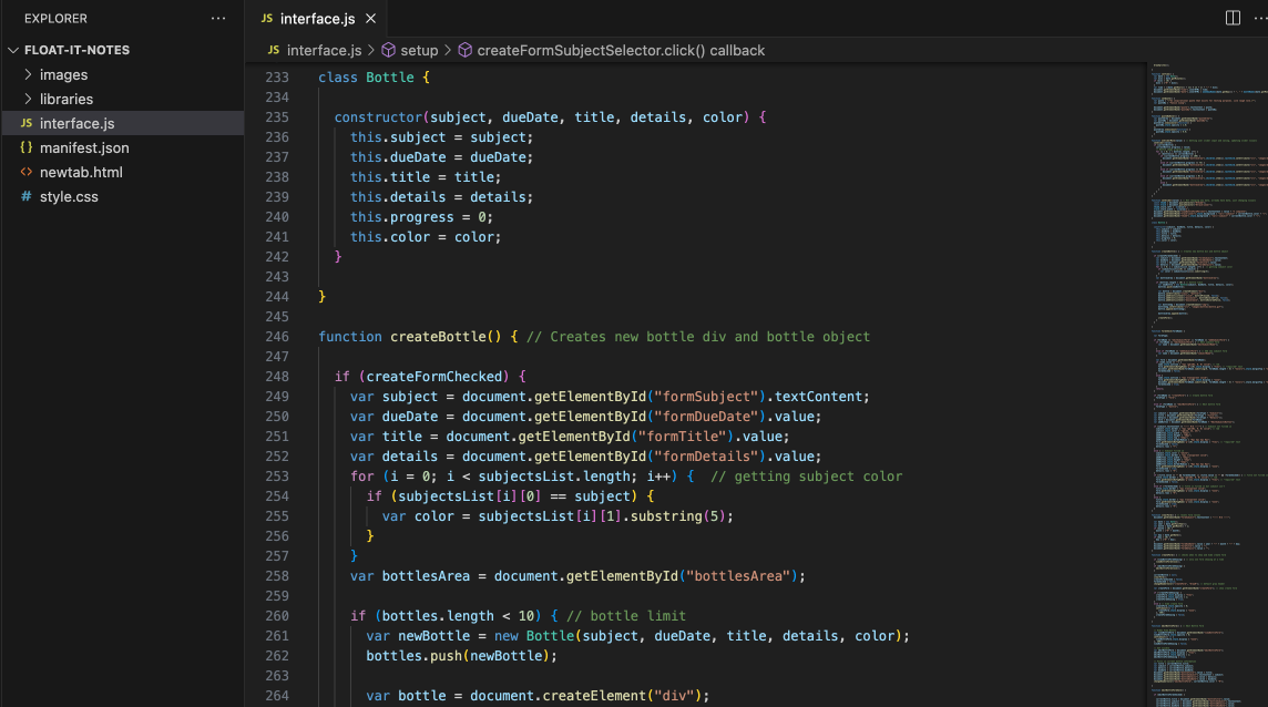
Screenshot of Float-it Notes’ code
Next Steps
This project has been incredibly enjoyable and rewarding as it allows me to put both my design and development skills to the test. Here are my future plans for Float-it Notes:
1. Refining graphics and cleaning up code.
Now that the deadline of the Senior Capstone Exhibition is behind me, I have more time to refine extension’s UI and codebase. My immediate priorities are polishing up graphics and completing implementation of data storage via Google account before releasing the first public version.
2. Publishing Float-it Notes!
The big moment where I share my passion project with the world! :)
3. Adding continuous improvements.
After the extension is released with all of its core features of being a functional task tracker, I plan to build in the remaining MoSCoW items and make further improvements as I receive more user feedback.
