BunkBuds
Roommate Matching App
My Role
UX Designer
Team
3 designers
My Tools
Figma, Google Forms
Overview
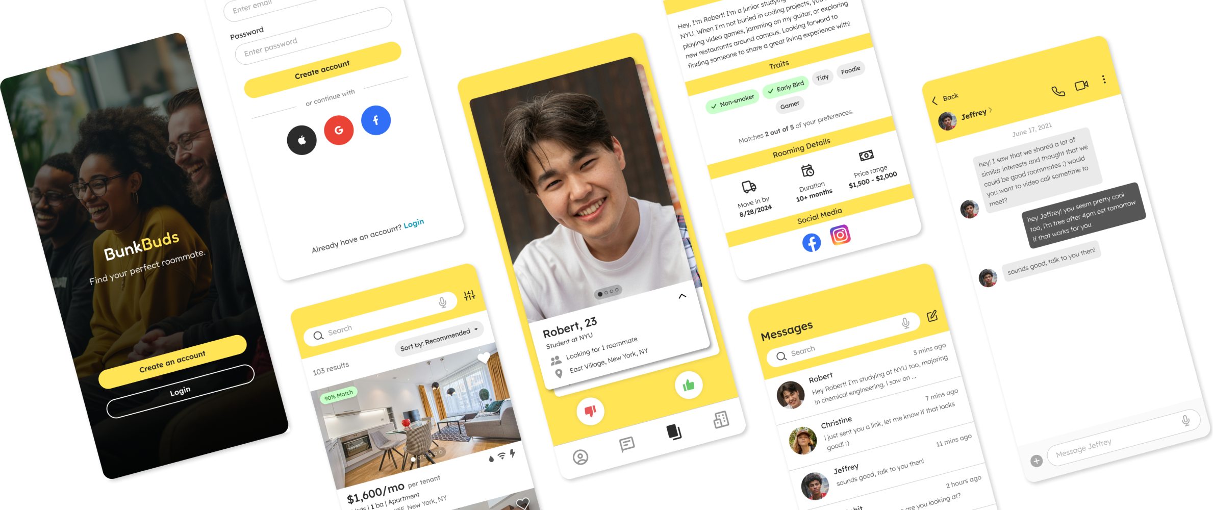
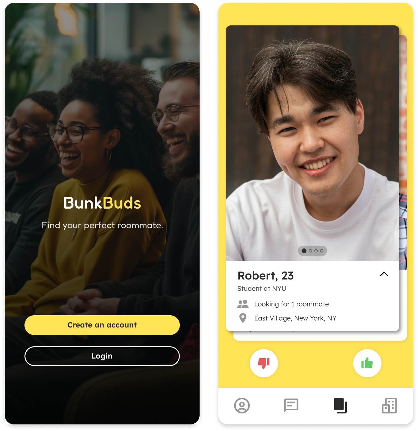
BunkBuds is a mobile app designed to help young adults in cities find the perfect room and roommate in an easy, safe, and enjoyable way. It matches users with potential roommates based on their preferences, helps find suitable living spaces, and offers resources for smooth cohabitation.
I worked in a team of 3 designers.
As a UX Designer within a team of 2 other designers, I conducted competitive analysis and user research, led the development of personas and journey maps, and designed wireframes for the app's user experience. Following the completion of our group efforts, I refined the mid-fidelity designs we created into high-fidelity screens.
Problem
Young adults living in cities often struggle to find compatible roommates, leading to significant time investment and negative impacts on their well-being.
As young adults living in cities transition to independent living, high living costs often mean they need to split rent with roommates. Traditional methods of finding roommates, such as word-of-mouth, social media, or generic listing platforms, often fail to meet the specific needs of this tech-savvy, socially conscious generation. This results in long search times, stress, and higher chances of mismatched living arrangements, causing conflicts and instability in their daily lives.
Goal
Make it easy and safe for young adults living in cities to find the ideal roommate.
Process
Researching roommate finder apps and other related apps
To start off, my teammates and I analyzed 6 popular room and/or roommate finder apps and other apps with similar functionalities.
From this research, we identified several opportunities to enhance BunkBuds with features that have proven beneficial in other apps:
-
Innovative matching. Combine Tinder's swiping feature with Roomi's background checks and detailed questionnaires for safer and more exciting matches.
-
Advanced search filters. Offer a wide range of search parameters to refine roommate and room searches, ensuring relevance to user preferences.
-
Diverse communication methods. Provide text, call, and video call options for online interaction so users can get to know each other online before meeting in person.
-
Detailed listings. Display landlords' profiles and details on listings for easy access, increasing trust and transparency.
-
Communal living resources. Offer additional resources (such as tips on bill management, chore division, and shared groceries) to support smooth transitions harmonious cohabitation.

Apps with similar solutions and target audiences researched
Learning about rooming experiences from 18-25 year olds
Next, we conducted anonymous surveys using Google Forms, targeting 21 students aged 18-25 within the NYU community and extended networks. Our goal was to understand the concerns and desires young adults have during the roommate and room search process, enabling us to better cater to their specific needs with our solution.
Participants were asked about their:
- Living and lifestyle preferences.
- Past or current rooming experiences.
- Current solution(s) to finding a roommate or room. If applicable, experience with their college’s roommate matching system.
- Type of qualities preferred in a roommate.
Key findings from participants' responses included:
-
Desire for more filtering options and communication methods. Experiences of college roommate matching systems were generally positive. However, many expressed a desire for more options for selecting roommates and the ability to connect with potential roommates beforehand.
-
The main considerations when evaluating a potential roommate. Key factors included cleanliness, trustworthiness, safety, responsibility in paying bills, and potential personality or lifestyle clashes. Based on this information, we optimized BunkBuds to include filter categorizes most important to users.
Creating personas for roommate seekers
Our previous research provided a deep understanding of our target audience's lifestyles, motivations, and concerns, which shaped the development of 2 personas, Naomi and Arjun.
While both Naomi and Arjun are searching for a roommate, their differences in age, occupation, personalities, likes/dislikes, and circumstances mean that their criteria for a roommate vary significantly. By adopting Naomi's and Arjun's perspectives into our design process, we aimed to make BunkBuds a versatile and useful app for a broad spectrum of users.
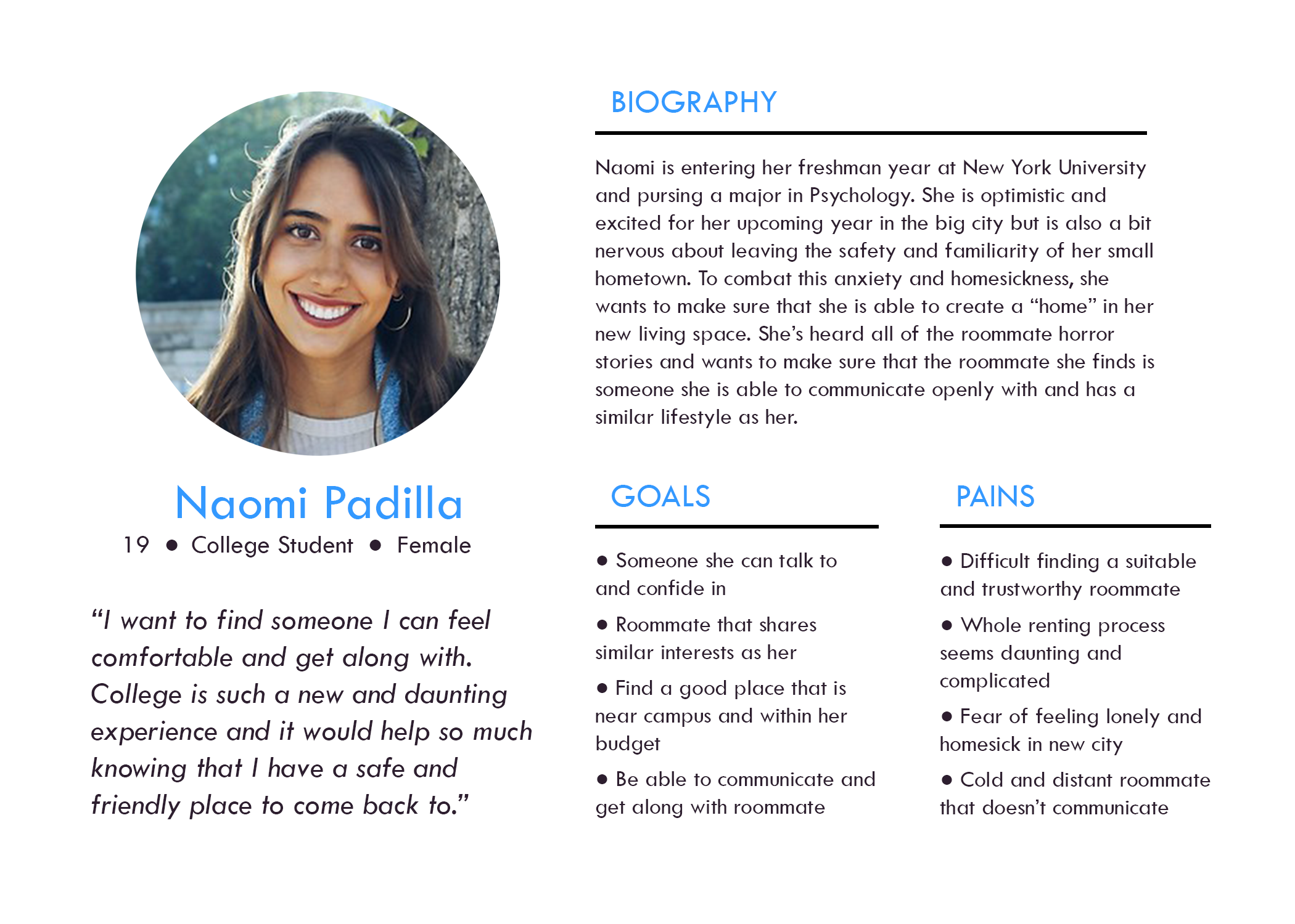
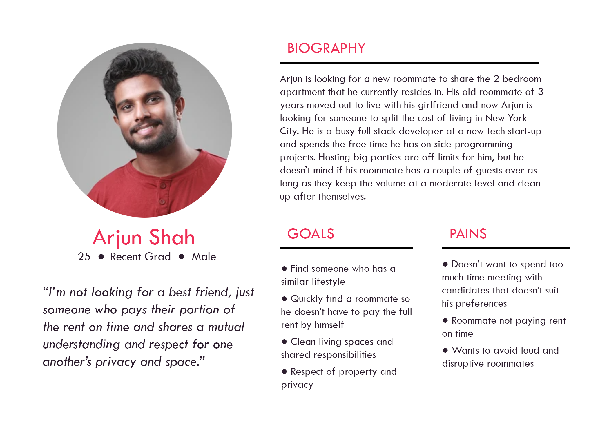
Two personas, Naomi and Arjun, representing diverse user groups
Developing journey maps and user flows
I led the development of journey maps for Naomi and Arjun, portraying two scenarios demonstrating how users might use BunkBuds to find a roommate and fulfill their individual goals. Each of these experiences has its own highs and lows in terms of user satisfaction.
These journey maps helped pinpoint pivotal moments where we could capitalize on positives emotions and take proactive measures to alleviate negative feelings throughout the user’s app experience.
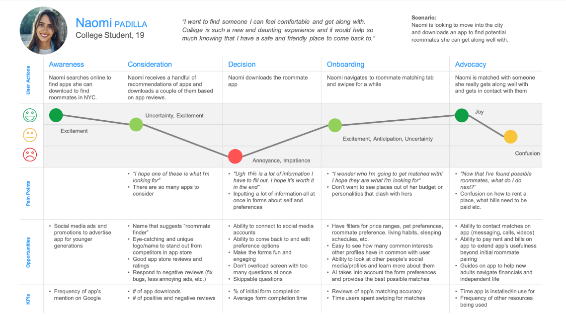
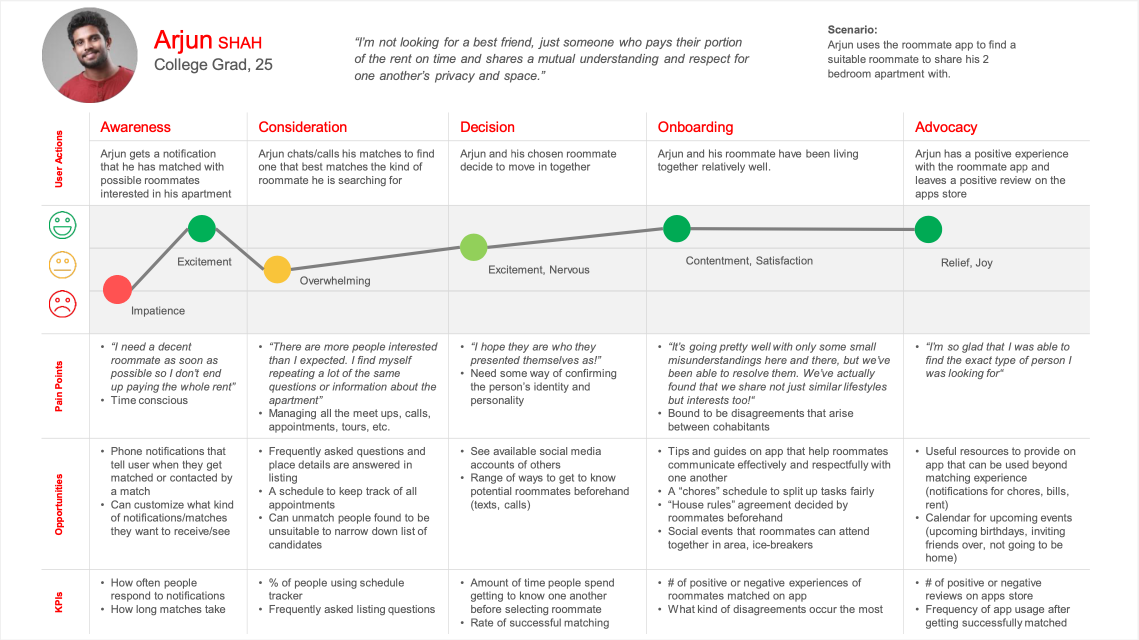
User journeys of Naomi and Arjun captured in experience maps
Then, to gain a more granular understanding of the user experience in accomplishing specific tasks, we utilized user flows to showcase these common scenarios:
- New user onboarding. New user creates an account, matches with a potential roommate, and sends them a message.
- Returning user check-in. Returning user browses through apartment listings and checks messages from potential roommates.
Our 2 user flows for new and returning users shows the different screens they visit and the decisions they make as they complete their goals within the app. This informed our product layout, ensuring that each step of a user’s session is efficient and purposeful.
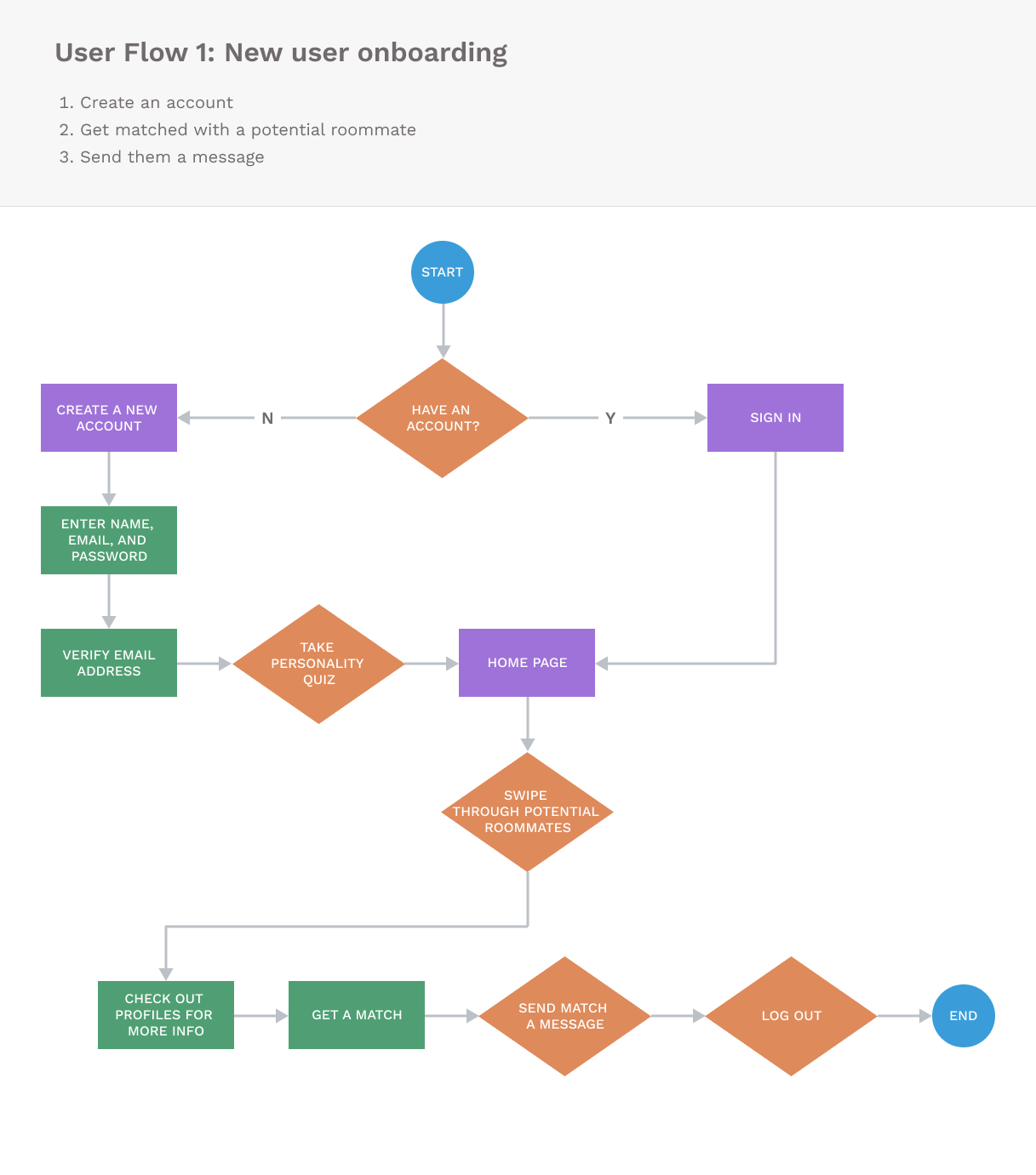
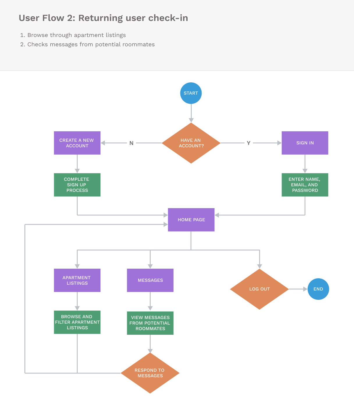
Two user flows for new and returning users
Designing mid-fidelity wireframes
Drawing from insights gathered through competitive analysis and user research, we began creating wireframes for BunkBuds. To streamline the design process, we divided the responsibility among team members, assigning each person specific screens to lead.
I focused on the designs of the Home and Profiles pages while my teammates
concentrated on the Sign In/Sign Up, Listings and Messages screens. These
initial designs served as a solid foundation as we continually iterated on them
through collaborative brainstorming and feedback sessions.
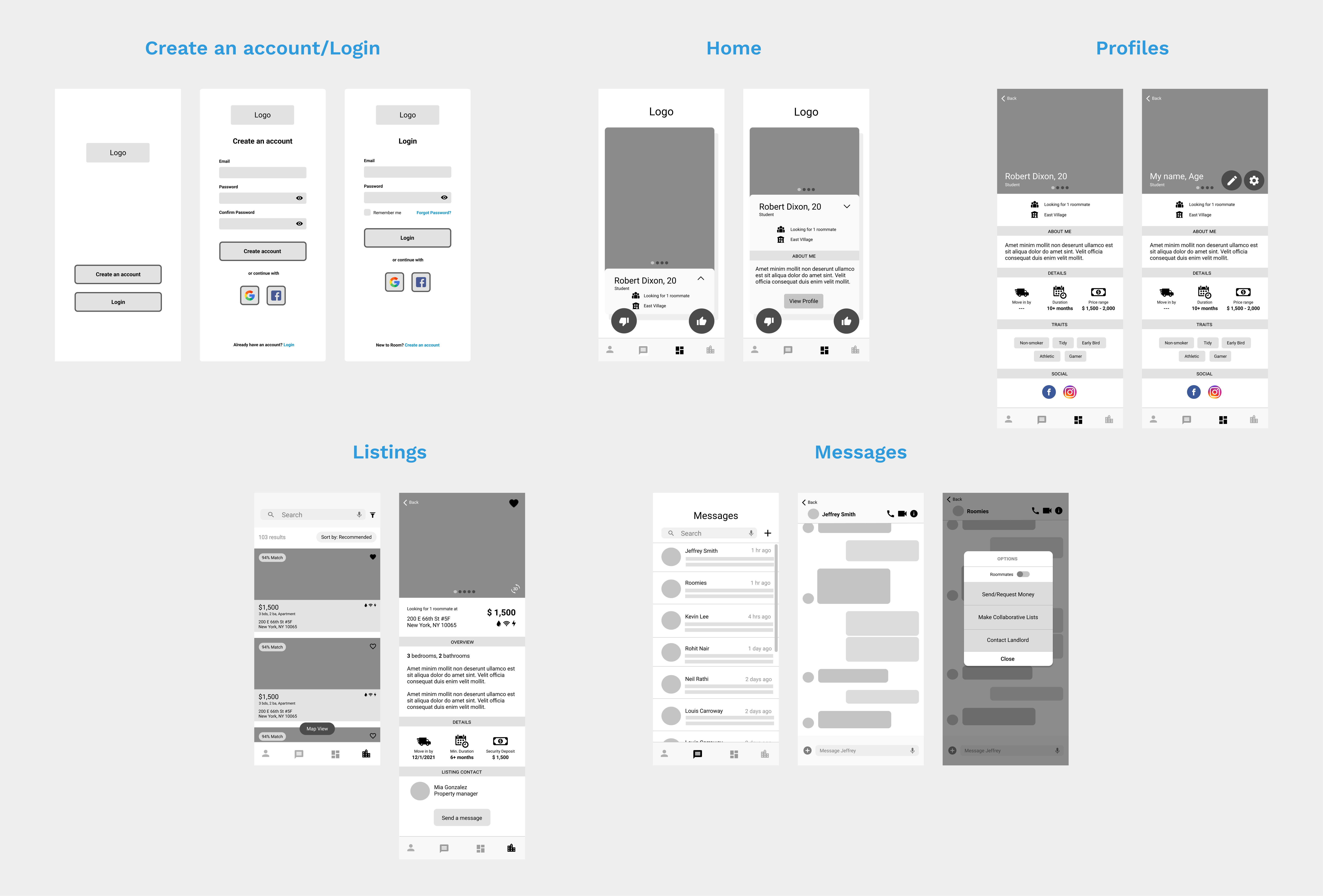
Mid-fidelity wireframes
Polishing into high-fidelity designs
As my team's goal was to conduct user research and develop simple wireframes, our group work ended after the mid-fidelity designs.
Independently, I polished the wireframes into high-fidelity designs, transforming the basic layouts into a more polished and visually appealing interface.
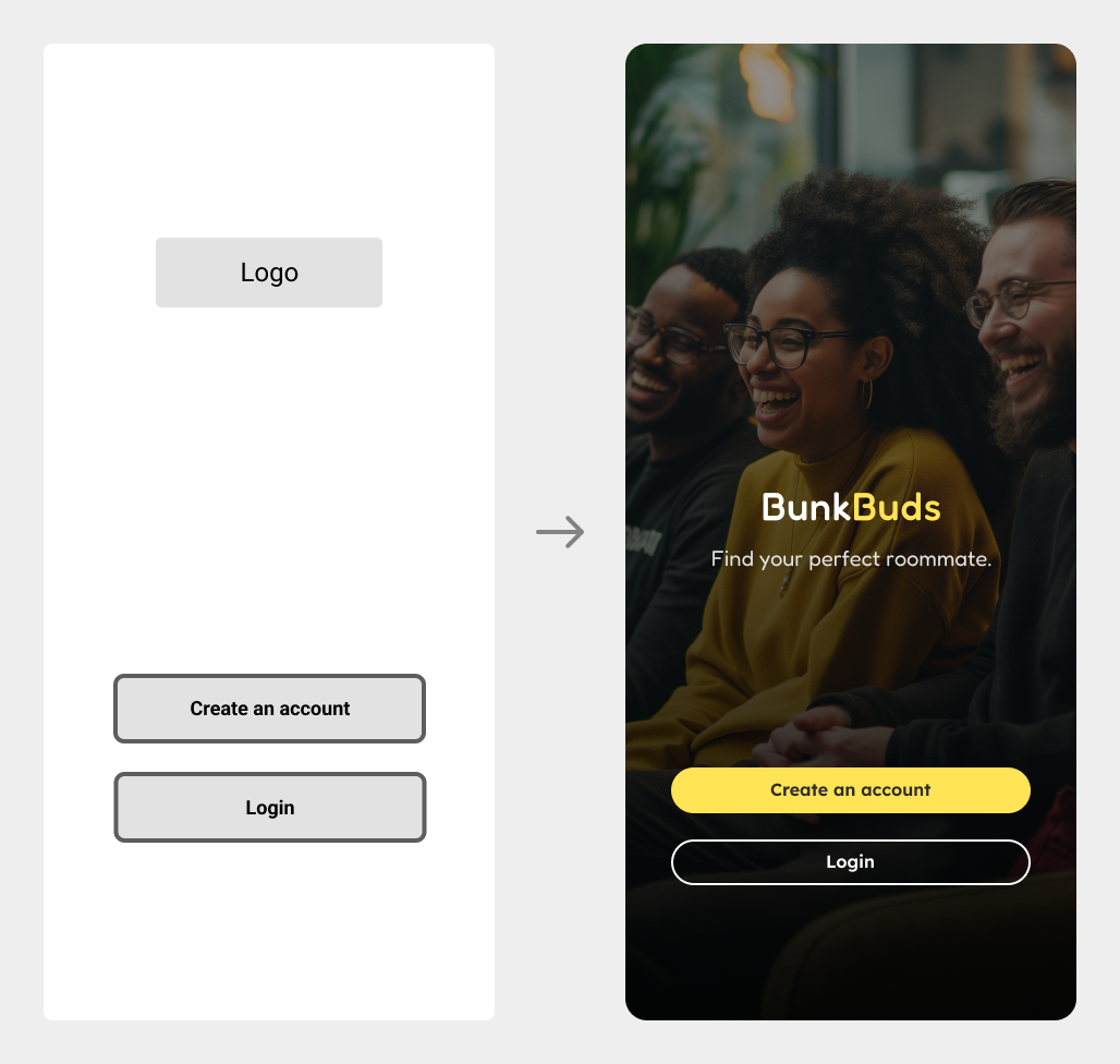
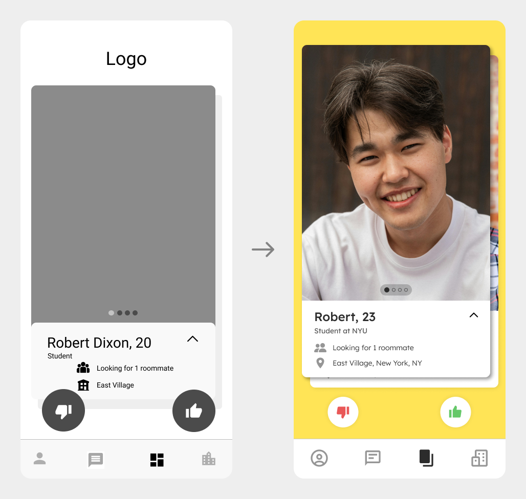
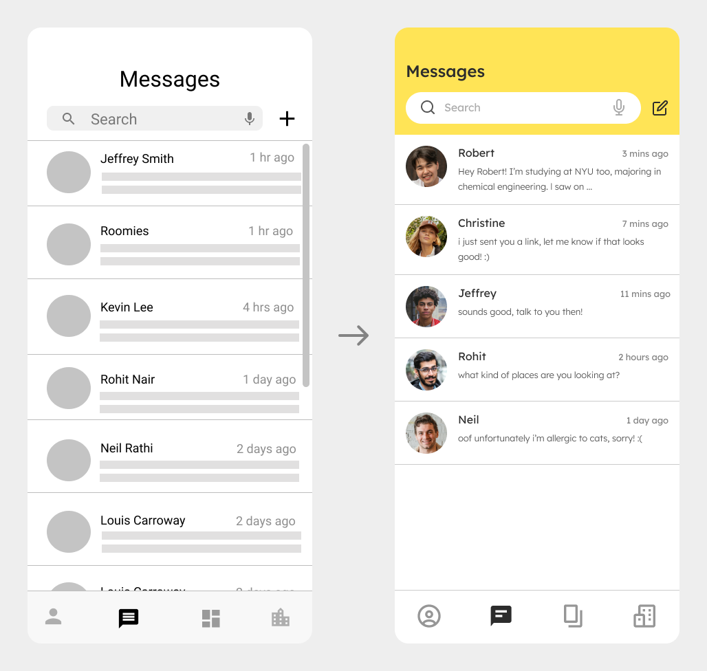
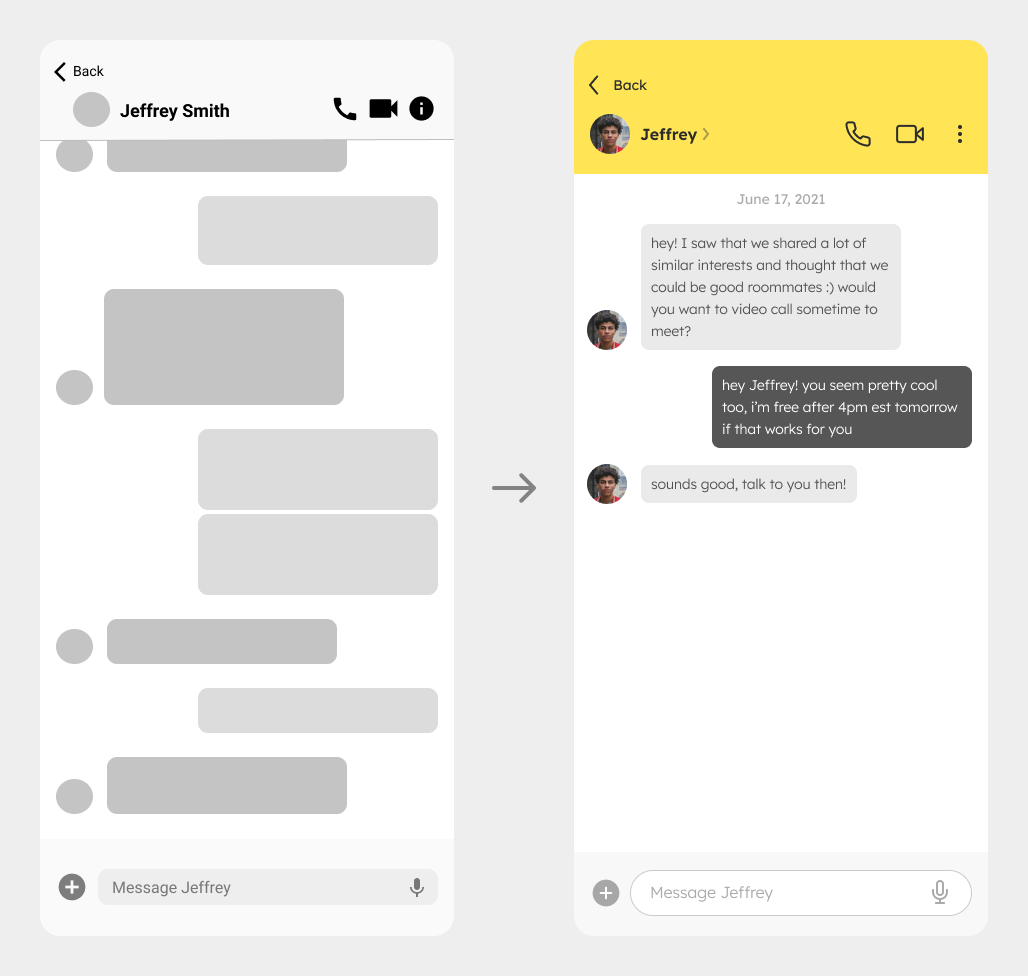
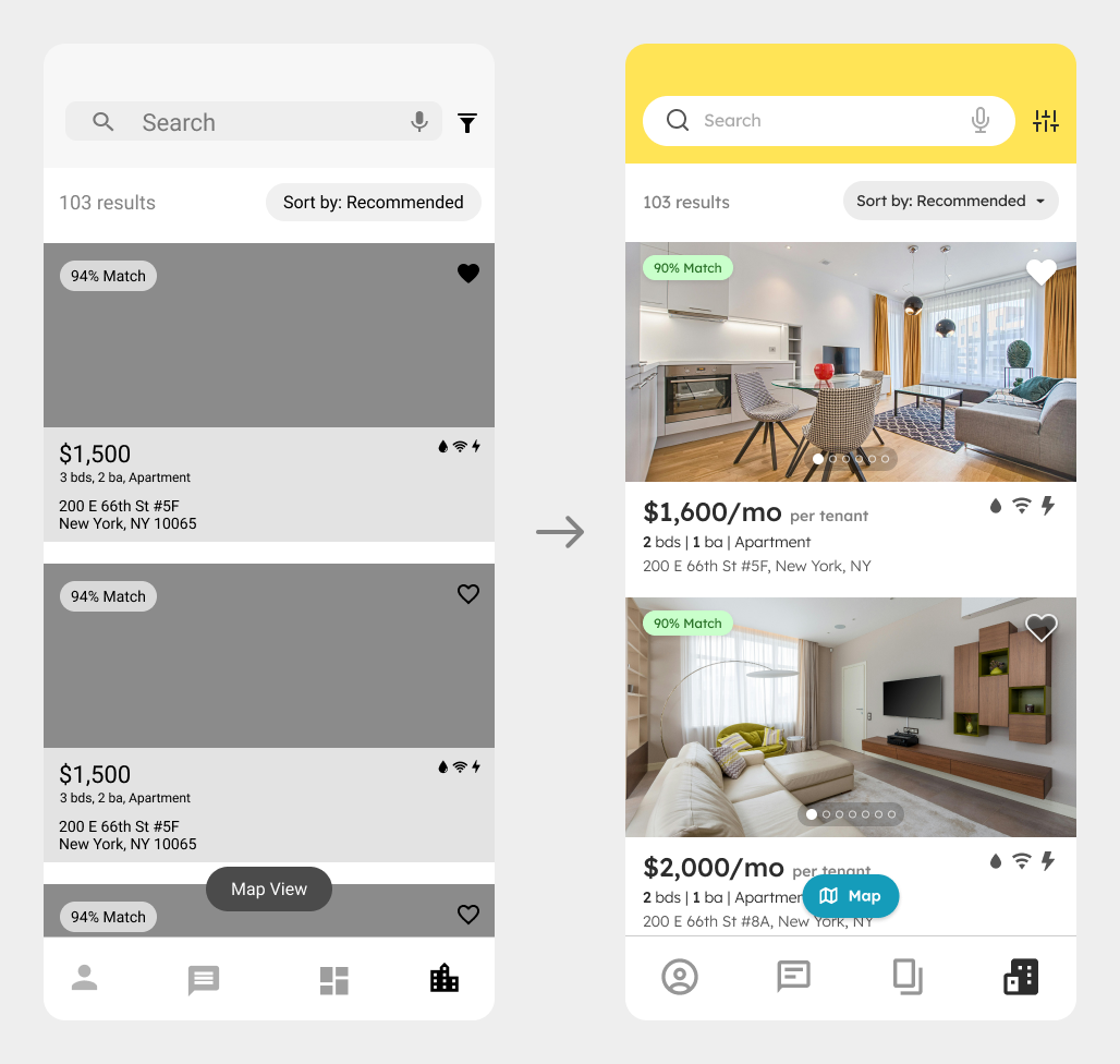
Before and after refining designs
Reflection and Learnings
Working on this project with a team of designers has been an exciting and valuable experience. I thoroughly enjoyed the collaboration and shared passion throughout the process. Here are my top 3 takeaways!
1. Collaborative brainstorming.
I appreciated how each member brought their unique perspectives and ideas, which made our brainstorming sessions dynamic and inspiring. By bouncing ideas off each other, we often came up with solutions and features we wouldn’t have thought of independently.
2. Coordinating team effort.
This experience taught my teammates and me how to work as a cohesive design team. We divided tasks among ourselves based on each member's strengths and interests, fostering a collaborative environment where everyone was motivated and could contribute effectively.
3. Enhancing communication skills.
Working in a team setting allowed me to practice articulating my ideas clearly during team presentations and design discussions, while also developing my ability to give and receive constructive feedback. Collaboration with other designers is something that I’ve found I really enjoy and will aim to seek in future opportunities!
