Pypeline
Data Lifecycle Management Platform
My Role
UX Designer, Front-end Developer
Team
3 product managers, 1 designer, 17+ engineers
My Tools
Figma, JavaScript, React, HTML/CSS, Bitbucket, JIRA
Overview
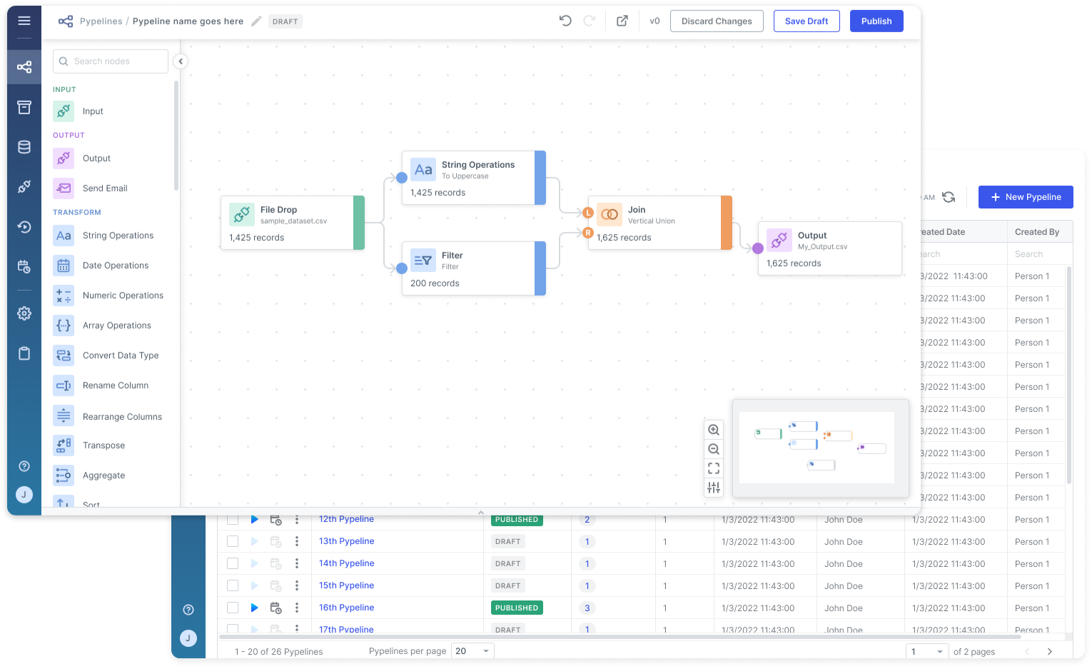
Pypeline is a cloud-based software tool designed to help data professionals streamline their data handling. This project aims to make managing, cleaning, and transforming data simple through an intuitive, no-code platform.
I was the sole designer on the founding team.
I joined the Pypeline team as a UX designer on a global team of over 20, including product managers, software developers, data scientists, and DevOps engineers. For a year and a half, I oversaw all aspects of the end-to-end UX design process, ensuring the seamless delivery of a comprehensive and user-centric product.
Problem
Many financial data professionals struggle with inefficiencies and reliability issues handling large volumes of data due to outdated tools and manual processes.
For financial institutions handling large volumes of transactions daily, seamless access, processing, and integration of large datasets at scale are crucial. However, current solutions used by data professionals often rely heavily on Excel, manual processes, and a complex array of ETL (Extract, Transform, and Load) tools, leading to inefficiencies, risks to data reliability, and increased costs.
Goal
Provide data professionals with intuitive, transparent, and streamlined management of their data lifecycles.
Process
Defining objectives with the product team
At the beginning of the project, I collaborated with product managers to shape the product vision, understand our stakeholders and their needs, and create an initial roadmap with core features and time estimates for Pypeline’s MVP release.
Researching existing data lifecycle management solutions
In addition to working with the product team, I also researched 8 similar solutions for data lifecycle management. I took note of their capabilities, targeted users, selling factor(s) that sets them apart from others in the field, and branding/UI. Some had free trial offerings that I signed up for to get a better sense of an end user’s experience.
This competitive analysis was useful in gaining insight into the landscape Pypeline was entering and the expectations around standard data management tools. It also helped inspire ideas for additional features that would enhance or improve upon the strengths and weaknesses of existing solutions.

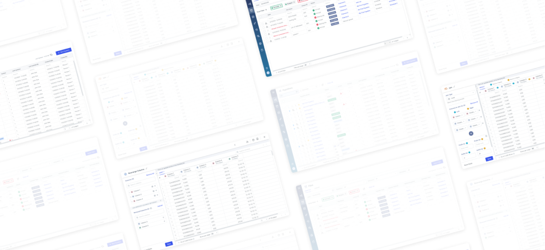
Similar data lifecycle management solutions researched
Laying out product sitemap and user flows
To organize and account for all of the planned product features, I created a sitemap detailing the application’s screens and functionalities available on each. Various user flows were made depicting the steps users with different goals would take during their app experience.
These artifacts helped ensure that certain features were available to users at relevant times and served as a reference for creating the initial wireframes.
Conducting regular user testing throughout design iterations
Throughout Pypeline's development, I conducted user surveys, interviews, contextual inquiries, and A/B testing with over 15 participants to ensure that our solution effectively meets the needs of data professionals. Participants included both experienced client-facing team members and individuals with little to no knowledge of data lifecycles. Insights gathered from these sessions were used to enhance Pypeline's adoptability and usability for users with varying levels of software familiarity.
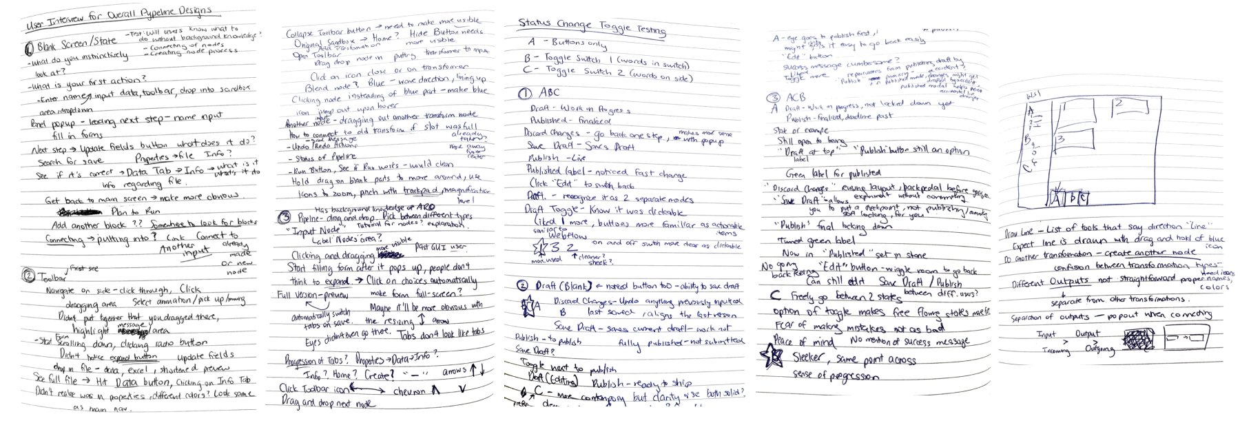
Various notes from brainstorming sessions and user testing
An example of design chages made based on user feedback is the UI of nodes in the sandbox.
The sandbox, a core feature of Pypeline, is the drag-and-drop workspace where users can visualize and build data transformation workflows. It provides users access to over 50 configurable data transformations via draggable “nodes”, with each node representing a step in the overall workflow.
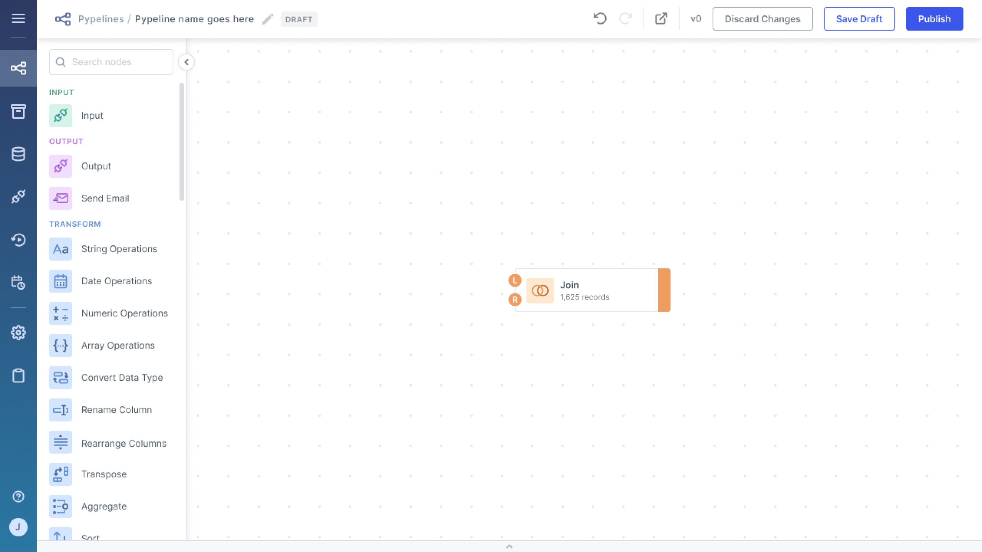
Example of a "Join" node in the sandbox
When the node is double-clicked, it opens up a modal with 2 sections that shows the details of that particular step:
- The form section (left) is where users can configure their data transformation settings.
- The data grid section (right) shows a preview of the data after the transformation has been applied.
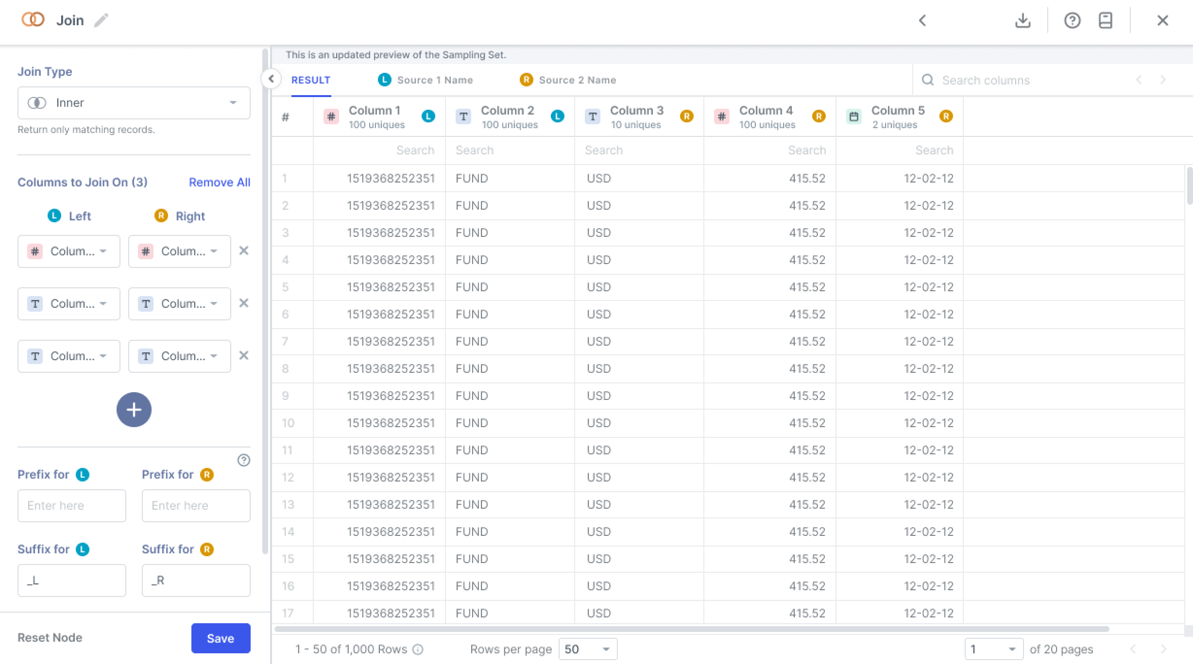
Modal for "Join" node opened on double-click
Some nodes, such as the “Join” node, offer multiple types of data transformations that can be selected using the first dropdown menu in the modal's form section.
In our case, the “Join” node offers 4 types:
- Inner
- Outer
- Vertical Union
- Horizontal Union
The problem with the initial node UI was that it only showed the node's name and the number of data records. For nodes with multiple types of transformations, users had to double-click on the node to see the selected type in its modal.

Initial "Join" node UI
While a roundabout solution was renaming nodes to include the transformation type (ex. renaming "Join" to "Join - Vertical Union"), it was a tedious and repetitive task and resulted in long, bulky node names. User testing revealed that users found information on transformation type useful, but the additional steps required to access it was a point of friction.
I addressed these issues in the new node designs by directly showing the
transformation type on the node UI in the sandbox.
The new node UI simplified access to transformation type details and received 100% positive user feedback in testing.
This change improved accessibility to valuable information and removed the need for node renaming. All test users reported that the inclusion of transformation types significantly enhanced their sandbox experience.

Initial "Join" node UI

New "Join" node UI
Facilitating the design-to-development process
Throughout the project, I worked closely with the engineering team, using my technical background to enhance our communication and workflow efficiency.
My key contributions to the design-to-development process were:
-
Providing detailed design documentation. I outlined all UI elements, interactions, and user flows with clear guidelines for smooth and accurate implementation.
-
Having regular team check-ins. I ensured aligment on design specifications, requirements, and technical constraints among all team members through frequent one-on-one conversations and team meetings.
-
Solving design implementation challenges with developers. During development, we encountered various roadblocks, particularly with the implemention of node modals. I collaborated with developers to achieve an 80-90% reduction in development time for this major component - from 2 to 6 weeks down to just a few days to 1 week per node.
-
Actively contributing to front-end development. I streamlined development efficiency by 10% by developing application features, user authentication pages, and resolving design alignment issues and bugs in JavaScript, React, HTML, and CSS.
Reflections and Learnings
Working on this project was an incredible experience that greatly contributed to my growth and development as a designer and developer. Here are my top 3 takeaways!
1. Taking ownership and fostering a UX design culture.
As the sole designer on the team, I developed my leadership by taking ownership of the designs and promoting a culture of inclusivity, collective ownership, and open communication.
This included:
- Advocating for UX best practices through presentations, one-on-one conversations, and clear documentation.
- Promoting early cross-functional collaboration to address the needs of all stakeholders.
- Ensuring regular communication and feedback sessions throughout the design process.
2. Creating and maintaining a design system.
My experience as the founding designer provided me with invaluable insights into creating and managing a consistent, scalable design system.
I learned to prioritize:
- Following best practices for design system management.
- Conducting regular audits to ensure consistency and effectiveness.
- Staying updated on new tools and technologies to enhance design and development efficiency.
3. Adapting to evolving business requirements.
One of the key challenges our team faced was adjusting to the dynamic nature of business requirements. As the project progressed, shifting business priorities and new stakeholder demands required us to adjust our design direction and feature prioritization. This experience highlighted the importance of effective communication and setting clear objectives and timelines at the start of each sprint, while also remaining flexible to changes.
